
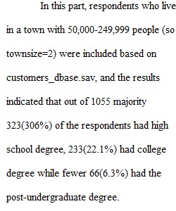
Q Exploring data with SPSS Watch these three videos and then complete the assignment below. Selecting cases and filtering data in SPSS Selecting cases and filtering data in SPSS (Links to an external site.) Explore and Summarize Categorical (Nominal or Ordinal) Data in SPSS (Ep.5) Explore and Summarize Categorical (Nominal or Ordinal) Data in SPSS (Ep.5) (Links to an external site.) Mastering Charts in the Chart Builder - APA Style Charts and Graphs in SPSS (Ep.7) Mastering Charts in the Chart Builder - APA Style Charts and Graphs in SPSS (Ep.7) (Links to an external site.) Create a word processing document to save your results. Open the customers_dbase.sav and use it to complete the following: (3 pts each) 1. Select respondents who live in a town with 50,000-249,999 people (so townsize=2). Create a frequency table of level of education and paste it into your document. Refer to variable view as needed. Describe what the table tells you. 2. Return to the full data set. Select respondents who live in cities with 250,000 or more people. Create an appropriate graph of primary commute transportation. Change the title of the graph to include the limited sample and paste it into your document. Describe what the graph tells you. 3. Return to the full data set. Select dog owners (number of dogs owned > 0). Create an appropriate graph for age in years (not the category). Change the number of bins on the histogram to 10, change the color to orange, change the title of the graph to include the limited sample, and paste it into your document. Describe what the graph tells you about the respondents in this data set. 4. Return to the full data set. Use the option to “split file” (under Data) by Gender and select the option to compare groups. Select Household Income and Credit Card Debt. Create tables showing mean, median, standard deviation, minimum and maximum of these two variables separated by gender. Describe what the table tells you about similarities and differences between male and female respondents. 5. Return to the full data set. Create a single bar chart with income category on the horizontal axis and both mean number of cats and mean number of dogs on the vertical axis. Change the vertical scale to start at 0.2 and increase by 0.05. Change the vertical axis labels to have two decimal places. Change the chart title to “Average number of cats and dogs by income level”. Describe what the graph tells you. Does this confirm or contradict what you would have thought about cats and dogs before? Explain.
View Related Questions